Charlie — Privacy-first AI assistant
Designing Trust Into a Conversational AI
I designed the moments that made a financial AI assistant feel understandable and optional before it ever asked someone to share sensitive context.
RoleDesign Engineer
TimelineMar 2026 – June 2026
ImplementationResearch, interaction design, AI-assisted functional prototypes, and shipped frontend work
What
Redesigned Charlie's core trust surfaces for an AI handling financial data: onboarding, data masking, and the pre-send review step.
How
User research turned directly into shipped screens — feature brief to functional prototype in 1-2 days, AI-assisted.
Impact
Cut privacy-related support tickets ~80% and user abandonment 40%; shaped the company's enterprise go-to-market strategy.
NDA Alert — mockups in this case study are illustrative, reimagined to protect sensitive product details while preserving the design approach, decisions, and outcomes that shaped the work.
01Context
A Privacy Layer, Not a Chat Feature
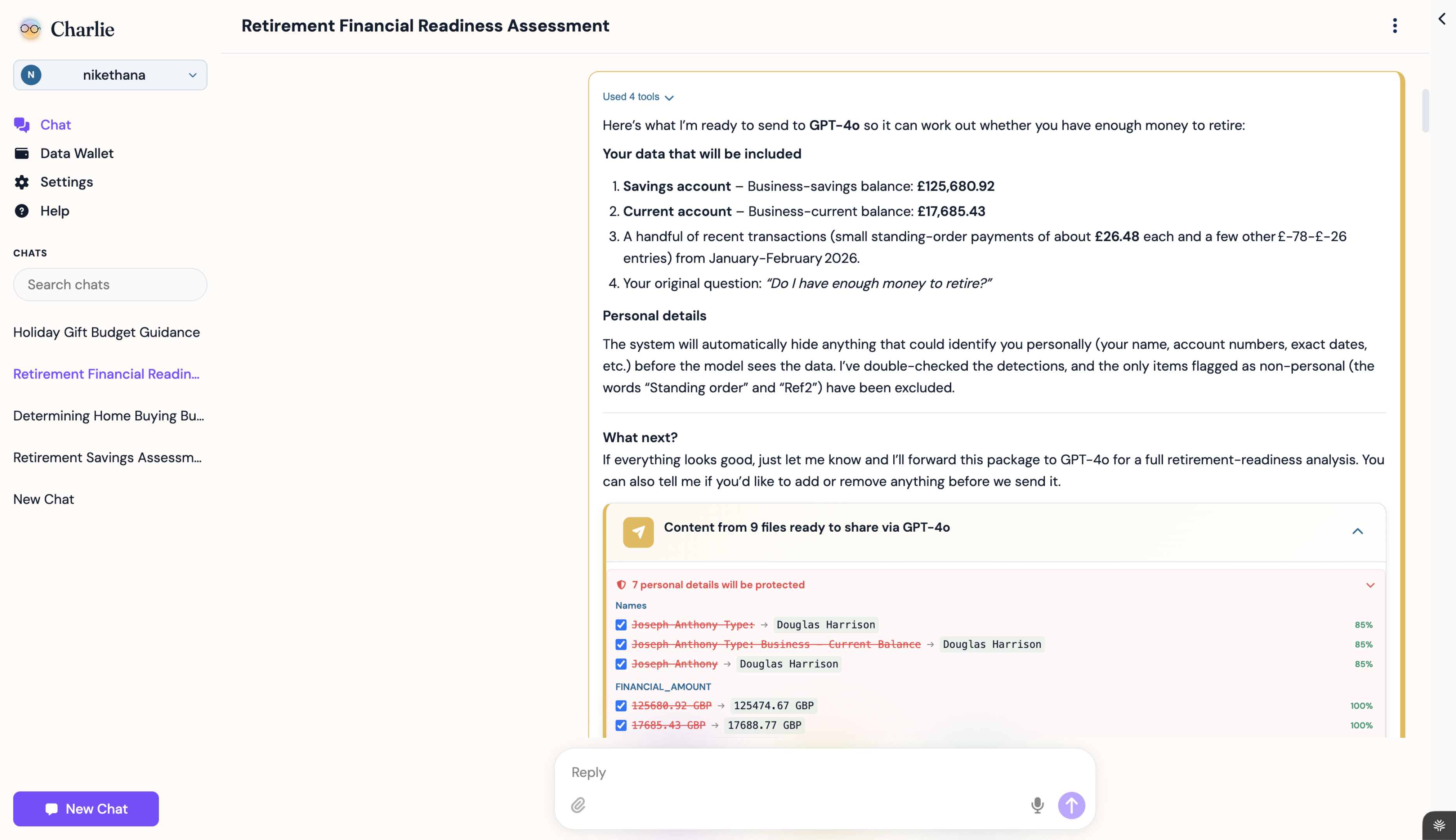
Charlie sits between user and model, masking identity before any query leaves the product.
Charlie is an AI-powered personal assistant that masks identifying data before a query leaves the product, so the model gets useful context without knowing who the user is. The first wedge was personal finance, where trust breaks quickly if security feels confusing or heavy.
I led user research, feature design, and rapid AI-assisted prototyping across onboarding, data masking, source ingestion, and recurring assistant tasks.

Fig: The gap between buyer requirements and end-user trust
02Problem
Make Privacy Feel Invisible
Every security step is a moment where trust either grows — or quietly breaks.
Users want deeply personalized financial answers, but the product has to handle sensitive data to get there. Every security step is a moment where confidence can grow, or trust can break.
The design challenge was making that infrastructure legible without making it feel like surveillance. Users needed clarity, control, and momentum inside the same flow.
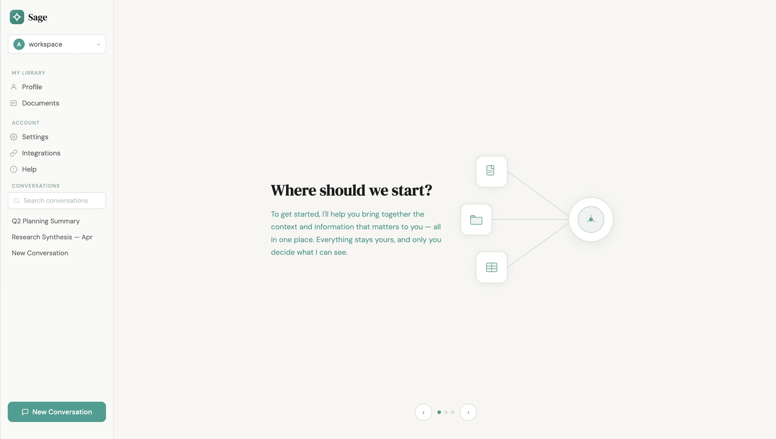
Fig: Onboarding flow
Decision: explain before you ask
Early builds dropped users straight into chat with no explanation of what Charlie was — not the model itself, but a privacy layer in front of one. I pushed to front-load that explanation. In interviews, users who saw it upfront understood the mechanism before their first query, and were already positive about Charlie by the time they reached the chat.
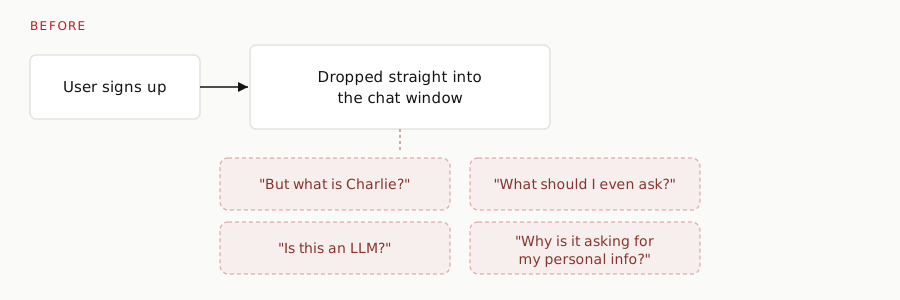
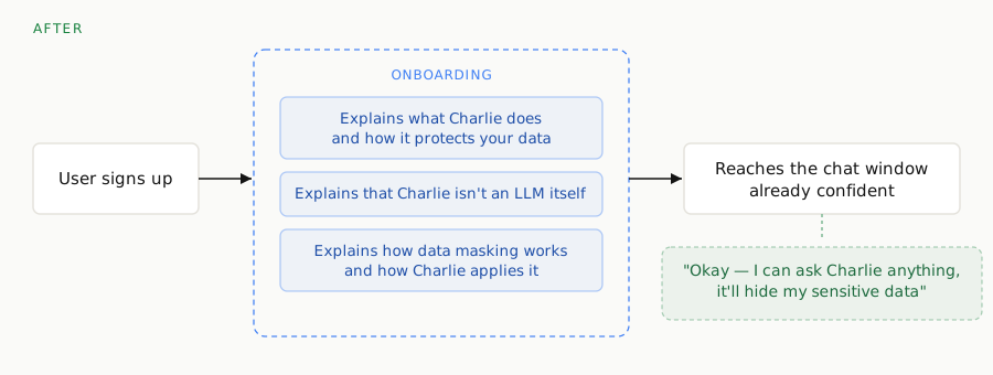
Fig: 4 unanswered questions at first contact, down to 0 — dramatic improvement in trust when users understood what was going on before being asked for anything

Fig: Masking a query before it leaves the product
Decision: choice over coercion
Early versions pushed users to connect a bank account the moment they landed. I pushed back — some users weren't comfortable linking an account, dummy or real, and preferred typing raw numbers. We replaced the push with a real choice: "You can connect bank accounts or give me raw numbers, whichever you're comfortable with."
This reframing cut privacy-related support tickets and user questions ~80%, measured against pre-launch support volume — trust was built through the product experience itself, not disclaimers or consent screens.
03Discovery
Not Waiting for a Brief
Proactive research surfaced four strategy questions leadership could use to shape the roadmap.
I ran 11 usability sessions across 2 research rounds and identified a critical trust gap that was driving abandonment. I advocated for human-in-the-loop checkpoints and formal usability testing — a change that reduced user abandonment 40%. The work quickly moved beyond screens into product strategy: who is this actually for, and what does each audience need to trust?

Fig: Observations turned into strategic product questions
In a B2B2C model, the enterprise buyer and the end user are different people. I translated session observations into four strategy questions that leadership could use to shape the roadmap.
The team's early focus was B2B sales — reasonable, but it risked treating end-user trust as secondary.
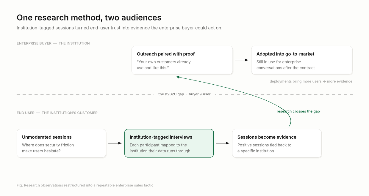
I flagged that if the product didn't hold up for real users, it would eventually undermine the enterprise pitch itself. The team agreed, and I took the initiative to lead the UX work directly.
04Design & Architecture
Features That Answered Real Questions
I moved fast by treating AI as a design-to-code partner - going from feature brief to functional prototype in 1-2 days. My focus was 4 modular pillars, each designed so privacy operates as invisible infrastructure:
1. Visualizing the Knowledge Graph: Translating a growing network of connected financial sources into an interface users can understand, manage, and audit at a glance. Personalizing recommendations across 6 connected financial data sources lifted discovery-flow completion to 69%, up from a lower baseline before personalization shipped.
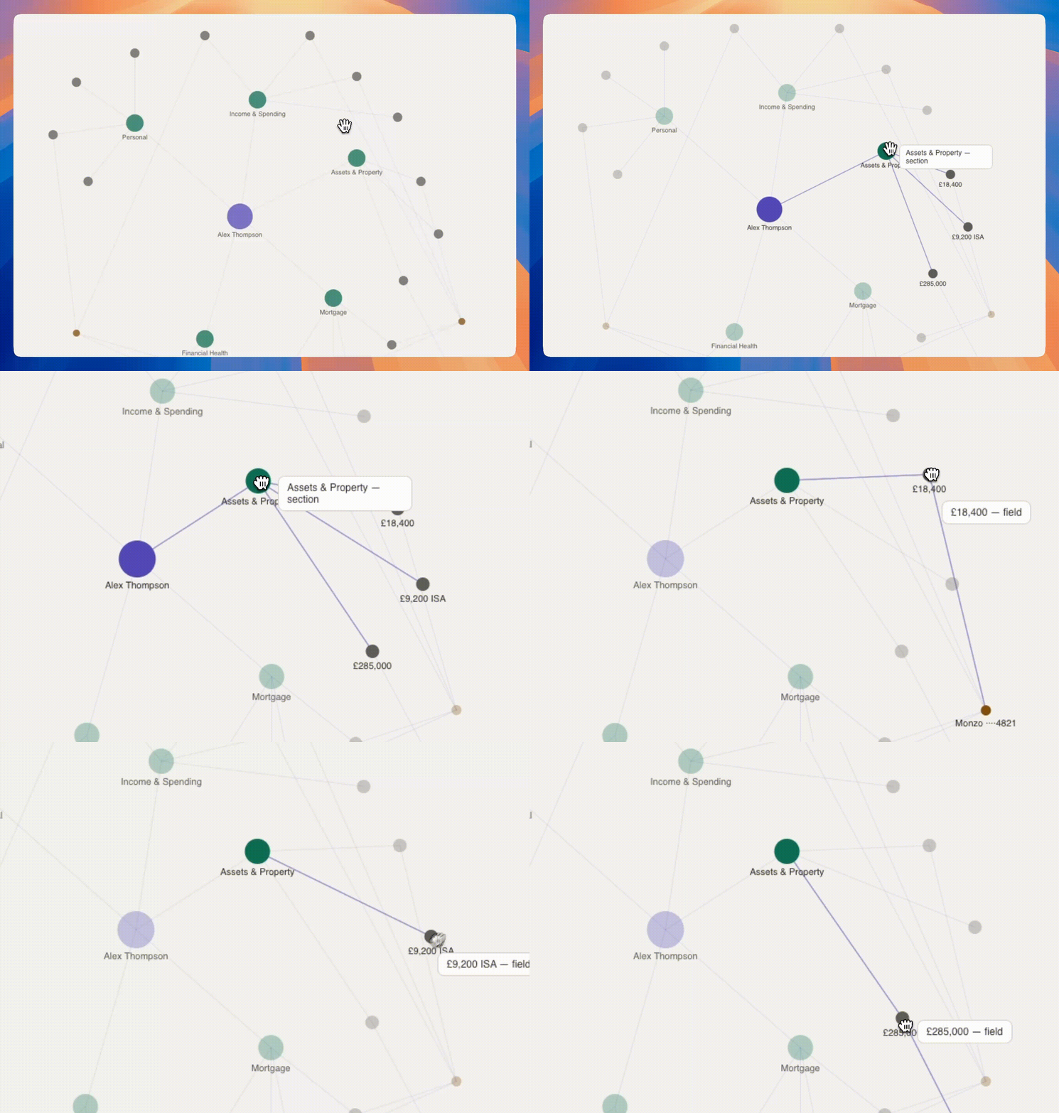
Fig: Interactive knowledge graph - Illustrative only; original data and structure withheld under NDA
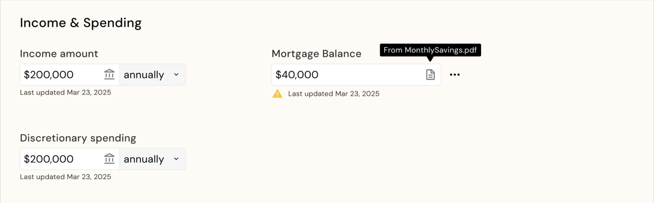
Fig: Source attribution shown in the user's profile
Takeaway — testing showed provenance mattered more to users than the masking itself — knowing where a number came from built more trust than hiding it did. Field-level source attribution across 15 profile fields cut user confusion 70%.
2. Frictionless Ingestion via Email Sync: A secure email-forwarding verification pipeline - frictionless enough that connecting a new source feels like a natural step, not a security checkpoint.
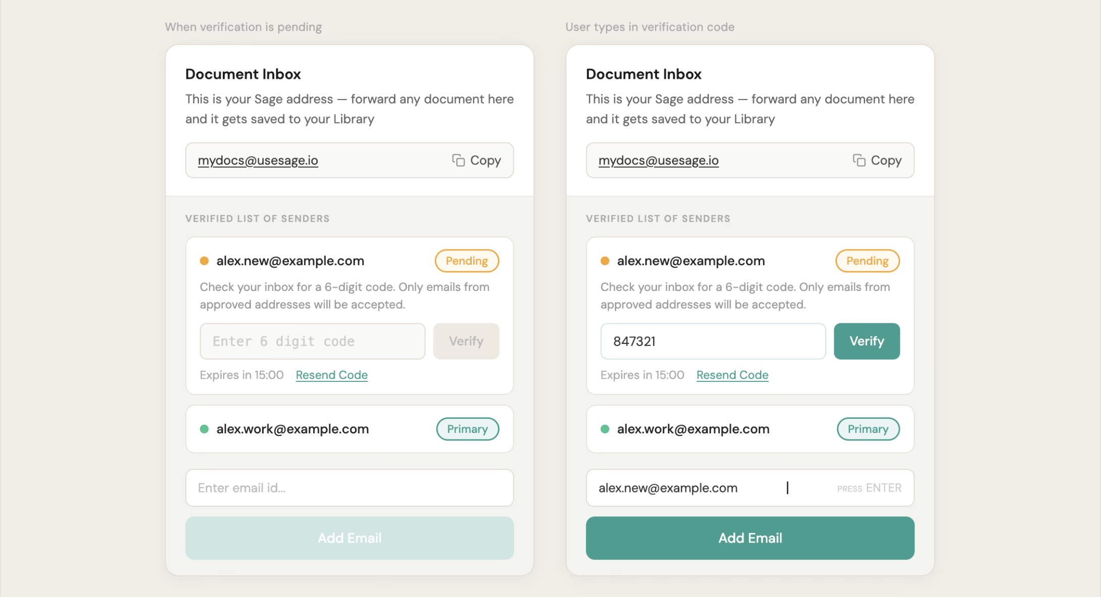
Fig: A way to connect through emails seamlessly
3. Local-First Voice Architecture: Protected sensitive user input while preserving the speed and naturalness of voice interaction. Aimed at users increasingly comfortable speaking to an assistant over typing; I began scoping a voice-first onboarding flow before the contract ended.
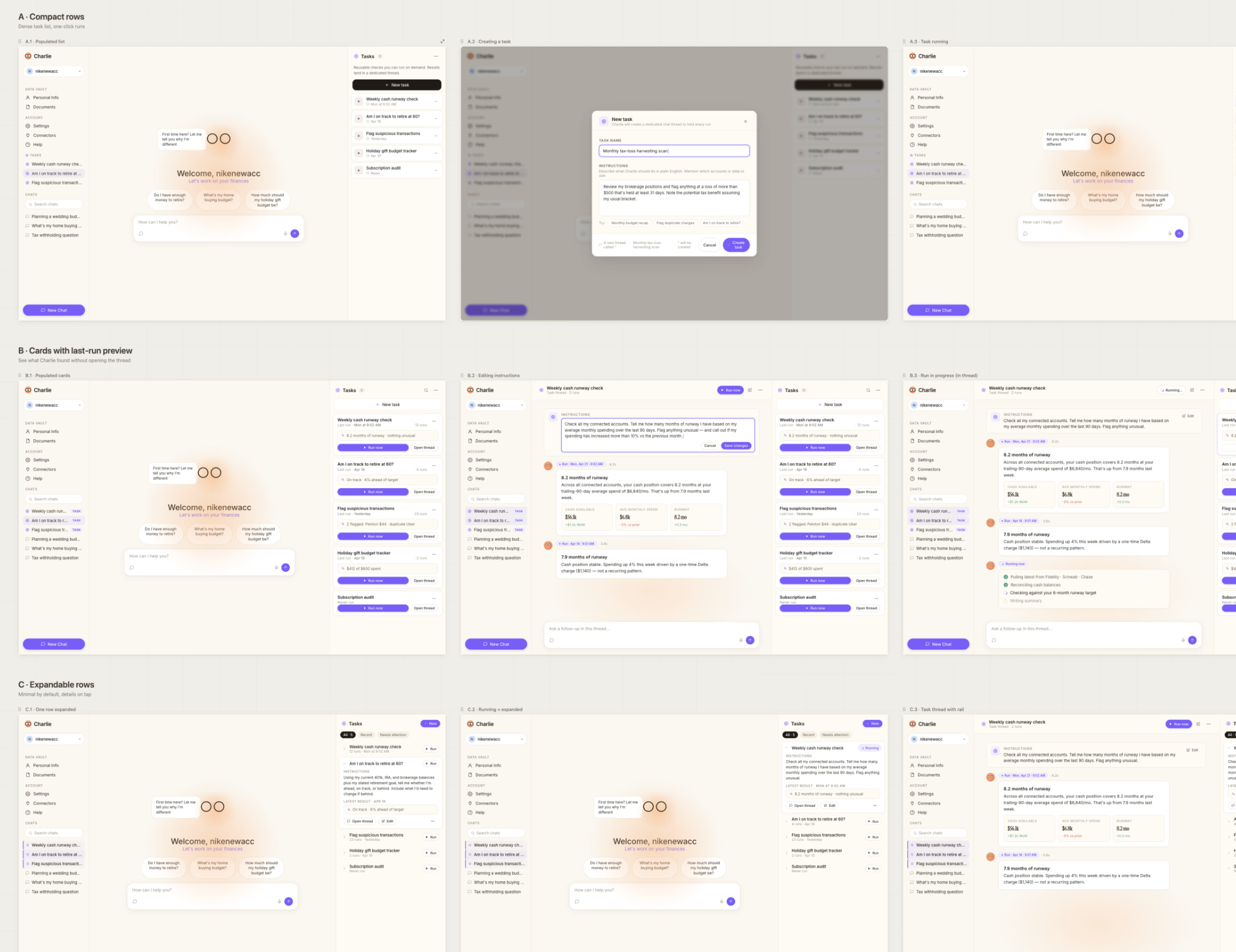
Fig: Exploring task execution UI with Claude Design
4. Autonomous Task Execution: A structured task-scheduling modal that lets users set up persistent financial check-ins in plain English - no configuration overhead. I owned 4 of 9 implementation tickets for this feature and shipped the frontend 79% faster than scoped (3 days).
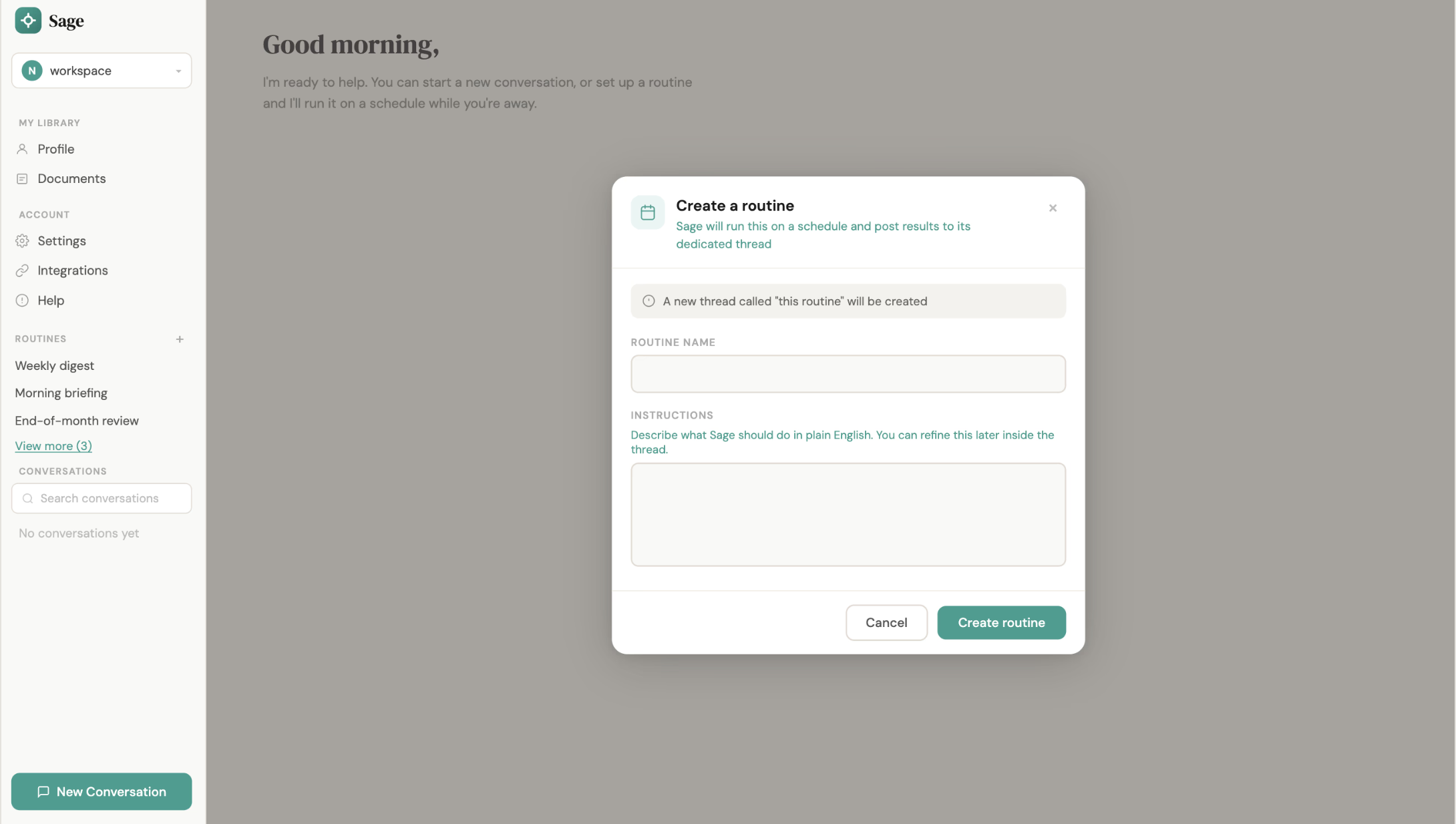
Fig: Tasks to run on recurrence
05Agent UX
Designing What the Agent Says While It Thinks
From generic filler to a live readout of what the agent is actually doing.
One of the first things I noticed after joining was the assistant's loading state: it cycled through generic filler — "Thinking...", "Pondering...", "Frolicking..." — copy that didn't match a security-first product handling sensitive data. I rewrote the phrases to be event-based instead, mapped to the actual backend action underway: a data lookup, a permissions check, a model handoff, each with its own phrase. Now, when the agent is working through something, users know exactly what it's doing, because the UI is telling the truth.
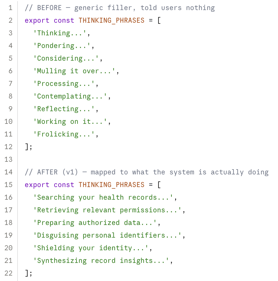
Fig: Generic filler replaced with phrases tied to what the agent is actually doing (illustrative reconstruction)
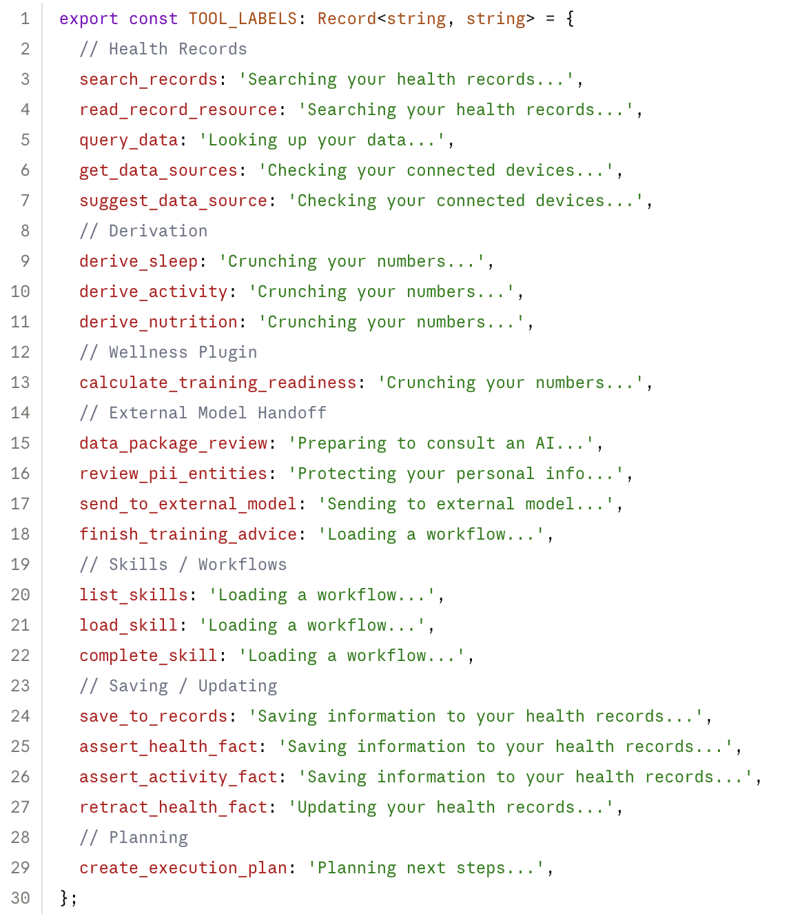
Fig: Every backend event mapped to its own phrase, so the copy tracks what's actually happening (illustrative reconstruction)
Takeaway — for an agent, thinking phrases aren't decoration, they're a live status readout. Static UX is designed around states; agent UX has to be designed around events. The backend is design material.
06Testing
One Thread, Four Sessions
Moderated testing on the Data Package Review step shaped the v2 direction for consent and trust.
I ran moderated evaluation sessions across mobile and desktop, focused on the Data Package Review component: the moment where users decide what context to share before a query goes out.
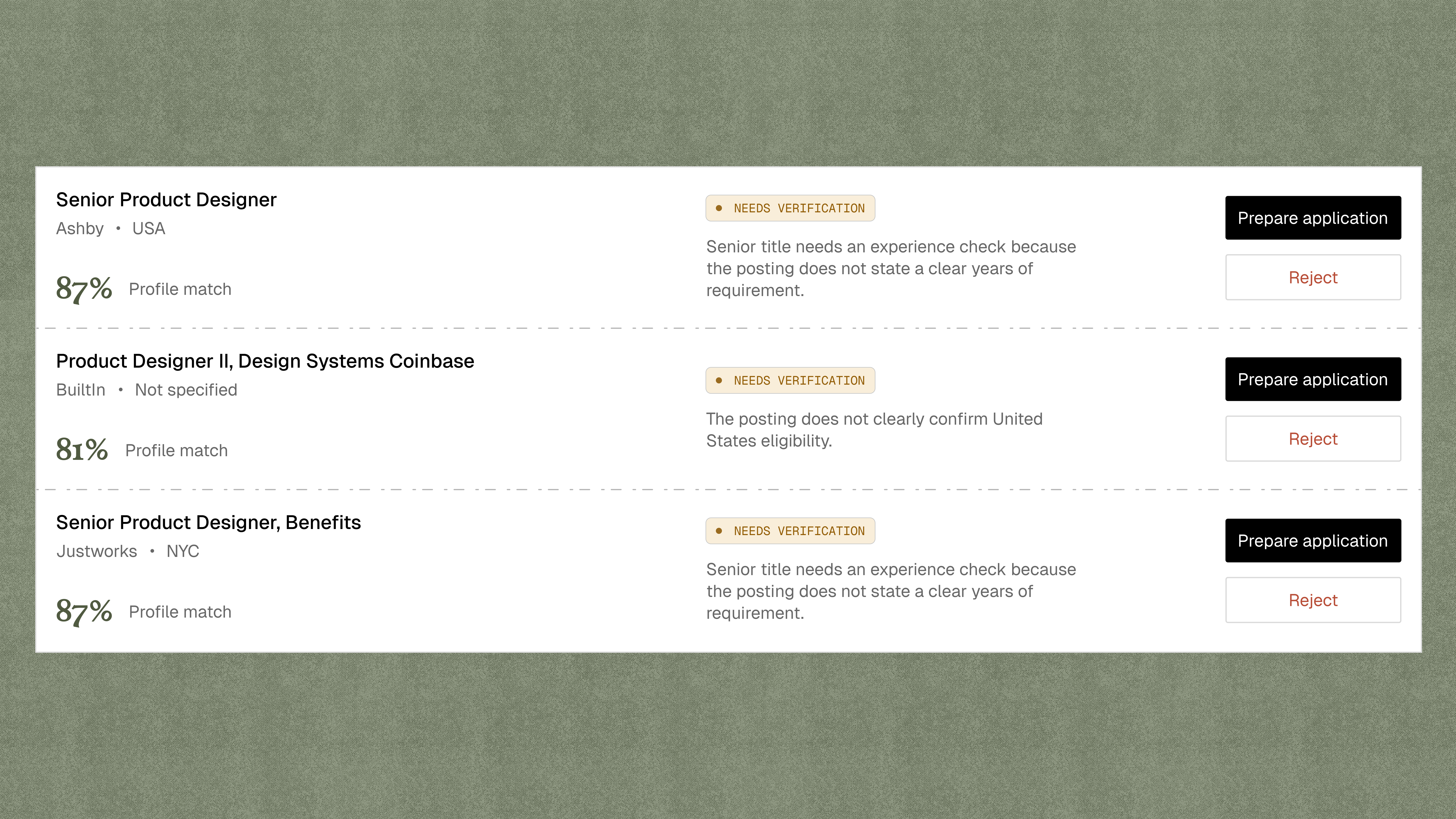
The early version of this screen surfaced every raw field being pulled — full transaction logs, unfiltered. Users asked the exact question you don't want at a trust checkpoint: "why does Charlie have this, and why is it about to leave?" I rebuilt the review UI around what needed to be shown, not everything that could be — which is what took abandonment down 40%.
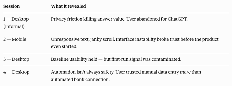
Fig: Brief insights from testing
07Impact
Built to Scale Trust
Research and prototypes shaped the roadmap, the testing strategy, and the story told to institutional stakeholders.
The research, prototypes, and interaction framework did not just produce screens. They fed into the product roadmap, the formal testing strategy, and the enterprise narrative presented to institutional stakeholders.
My contract wrapped in June 2026. By then, the institution-tagged interview method was already in use for enterprise conversations — a piece of the go-to-market approach that outlasted the placement itself.